Monday, April 27, 2009

isotherms


Isotherms are contour lines that connect points of equal temperature.

unclassed choropleth map


An unclassed choropleth uses a continous scale based on individual values instead of being grouped into classes. This map shows the variance in the fertility rate in Europe.

classed choropleth maps


A classed choropleth is a map that uses different shades and intensities of colors to group data into different classes. The main classes used are equal frequency, equal interval, and natural breaks. This map shows the different Florida counties and the percentage of their population that is Hispanic.

range graded proportional circle map

http://www.neiu.edu/~jrthomas/377/circle.jpg

A range graded proportional circle map uses different size circles to represent the size of data groups. The size of circles are chosen so the size of the groups represented can easily be distinguished. From this map, it can easily be seen where the largest populations of Mexican immigrants live.

Friday, April 17, 2009

accumulative line graph


This type of graph shows the distribution of a variable, such as population, compared against a independent variable such as income. An unequal distribution results in a curve. This map shows what the graph would look like if the data was equal as compared to the curved line, which represents an unequal distribution.

mental map


A mental map is a map that someone creates from their memory. This map represents someone's perception of each region of the United States.

nominal area choropleth


Nominal area choropleth is used to display number data. In this case the map shows the percentage of Hispanic population in the United States.

univariant choropleth


A univariant choropleth is used to show only one variable. This map shows the areas of highest population concentration in the United States.

standardized choropleth


A standardized choropleth is when the data is divided by another feature of the map, usually land. This map of Canada shows population size.

propaganda map


A propaganda map is used to promote skewed political views. This map is used to promote propaganda in the Middle East.

star plot


A star plot is used to display and compare multiple variables. This graph is used to compare different variables, such as mass and trajectory completion, of 5 different designs of a Mars Exploration Rover.

correlation matrix


A correlation matrix shows the strength and direction of linear relationships between two variables.

similarity matrix


A similarity matrix measures the similarities between objects. The greater the similarity the larger the value of the measure will be.

stem and leaf plot


A stem and leaf plot organizes numbers according to place value. This shows how to make a stem and leaf plot and how to determine what each line represents.

box plot


A box plot organizes numerical data into 5 different summaries. It groups it by lower quartile, median, upper quartile, minimum and maximum sample. This shows an example of how a box plot should look.

histogram


A histogram uses bars to represent frequency. This histogram shows percentage of price change between months.

parallel coordinates


A parallel coordinates graph shows muliple data and is organized around parallel lines that run veritically and are equally spaced. This graph represents data from several different airlines relating to such factors as 10 year growth and stock equity.

triangle plot


A triangle plot is used to visualize the ratio of 3 different variables that sum a constant. It is often used in the physical sciences to show the composition of systems that have 3 different species. This triangle plot is used to show the composition of soil and shows the different ratios of sand, silt and clay.

windrose


A windrose is a diagram that shows the wind direction and speed at a location over a period of time. This plot shows that the wind blew more frequently and was stronger from the south and southwest.

climograph


A climograph is a visual depiction of monthly precipitation and temperature of a particular location. The bars represent precipitation and the line represents temperature. This graph shows that in Mangalore, India June and July had by far the most precipitation but didn't have the highest temperatures.

population pyramid


A population pyramid shows the percentage of the population in each age range and breaks it down by gender as well. This population pyramid of a developed country shows a relatively rectangular shape that is achieved as people live to higher ages.

bilateral graph


A bilateral graph shows the relationship between two sets of data. This map compares trade between the United States and Europe and shows exports rising and imports went down.

index value plot


An index value plot plots index values instead of absolute numbers. This graph shows the relative daily index closings of six different countries.

scatterplot


A scatterplot uses points of data on a graph to show the relationship between two different variables. This graph shows the relationship between the log population and people within 20 km of a site.

DOQQ


DOQQ is Digital Orthophoto Quarter-Quadrangle. This is a computer generated image of an aerial photo in which cameral tilt and terrain relief have been removed to make it like a map.

DEM


DEM is Digital Elevation Model. This shows a digital representation of the terrain of the land.

DLG


DLG is a Digital Line Graph. This is a digital representation of contour lines to show geographic features.

DRG


DRG is a Digital Raster Graphic. This is a scanned image of a US Geological Survey.

isopleths


Isopleths are maps with connecting lines that connect points that have the same numerical value of some variable. This map shows the centimeters of precipitation in the United States.

isopachs


Isopachs are lines that connect points of equal thickness in rocks.

isohyets


Isoyets are lines that connect points that recieve equal amounts of rainfall. This map shows distribution of rainfall in the United Kingdom.

isotachs


Isotachs are lines of equal wind speed. This map shows areas of wind speeds as well as high and low areas of pressure.

isobars


Isobars are lines of constant atmospheric pressure. This map show the high and low pressure fronts over Europe.

LIDAR


LIDAR stands for light detection and ranging. It uses light in the form of a laser to detect the range of an object as well as other details such as size.

dopplar radar


Dopplar radar is used extensively in weather detection. It uses microwave signals which measure the echos to determine velocity. It can also detect precipitation or hail and is ideal for detecting large storm systems such as hurricanes and tornadoes. It also uses colors to distinguish intensity, which is shown in the above map.

black and white aerial photo


A black and white aeiral photo is taken from an airplane. This photo shows different geographical features such as trees and also shows houses and roads.

infared aerial map


Infrared radiation is used for such things as night vision because it's waves are longer than those of visible light.

statistical map

http://www.plu.edu/~alberttl/img/map.jpg

A statistical map is a graphic representation of data. In this map the number of Hispanic owned firms is shown for each state.

cartogram


In a cartogram, land area is distorted to display some other variable. In this map, the size and shape of each state is distorted to represent the number of electoral votes each state gave to each presidential candidate.

flow map


A flow map shows the movement of objects from one place to another. This map is a popular type of flow map that shows the flow of traffic in a region.

isoline map


Isolines are any contour lines that connect areas of equal values. Isotachs, isohyets, and isopachs are all examples of isolines. This particular map shows an example of isoyets.

proportional circle map


Proportional circle maps use circles that are set in proportion to the quantities the circles represent. This proportional circle map shows the size of the Filipino population in the southeastern and eastern United States in proportion to the size of circle in each state.

choropleth map


Choropleth maps use color to show variations in data. This map shows the number of males per 100 females in each state in the United States. It is interesting to see that in the eastern and central states there are always less males than females, but in the western states there are about equal amounts of each or in some cases such as Nevada and Alaska there are actually more males than females.

dot distribution map


A dot distribution map shows the distribution of data using dots to represent density. This map is especially used to show population density. This is a map of population distribution in South America.

hypsometric map


http://studentweb.usq.edu.au/home/w0061153/Picture-The%20hypsometric%20map%20of%20Xinjiang.jpg

A hypsometric map uses contour lines and sometimes color to show elevation. This map easily shows the different elevations and it can be seen where the mountain ranges are and the flat interior.

plss


A PLSS map is a map of the Public Land Survey System. It is used to divide land by boundaries and show ownership of property. This map shows the PLSS system dividing the state of Alabama.

cadastral map


http://www.dalisproject.org/images/cadastral_map.jpg

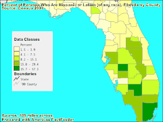
A cadastral map is used to divide land and show ownership. This map divides each county into different segments.

thematic map


A thematic map is a simple map that is used to show the different characteristics of a region. This map shows the median age distribution of each state and is also a form of choropleth.

topographic map


http://www.universityofcalifornia.edu/graphicresources/assets/maps/map_topo_rgb.jpg

A topographic map is used to display the physical elevation of land. This map shows the different elevations of the state of California.

planimetric map


http://www.loc.gov/rr/geogmap/guide/gm058002.jpg

A planimetric map shows only the horizontal features of a map. It does not show the elevation of the land.